“Where there is movement, there is improvement.” – Rick Helders
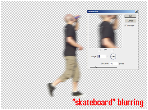
Contemporary architectural visualisations are full of motion blurred cut-out characters, seemingly done in the last possible minute before a deadline. The reason why artists blur people in their images is either to make them stand out less ( “unobtrusive animation” ) and/or to simulate the photographic exposure of real-life cameras. Apart from the usual lack of any colour balance whatsoever and the poor integration of the cut-outs,mistakes still very common in our industry, this “skateboard” blurring ( as characters appear to be moving in a linear, unidirectional and lifeless manner, similar to standing on a skateboard ) is a very annoying eyesore in otherwise nearly perfect visuals. “Skateboard” blurring is normally done by applying ( “Click-and-go!” ) the default motion blur filter in Photoshop (see example below).
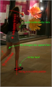
 Now, the cardinal problem with the automatic application of the motion blur filter is that it blurs the whole cut-out figure in a very uniform manner, not taking into consideration the human anatomy and character’s very specific movements in space. We, humans, as you know, are bipeds (until we have had a few pints of beer), i.e. homo erectus, and in order to move forward we have to put one of our legs firm on the ground while using the other leg to push ourselves forward, in the process of which we make a step; then reversed. Take a look at the following diagram below.
As you can see from it,which I sketched over a photography, not all parts of the body are equally blurred- some of them are blurred less, some more and there are even some parts that are not getting blurred at all!
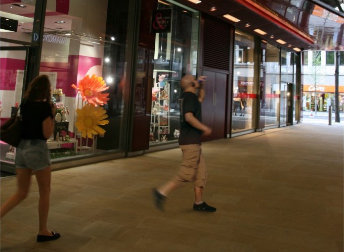
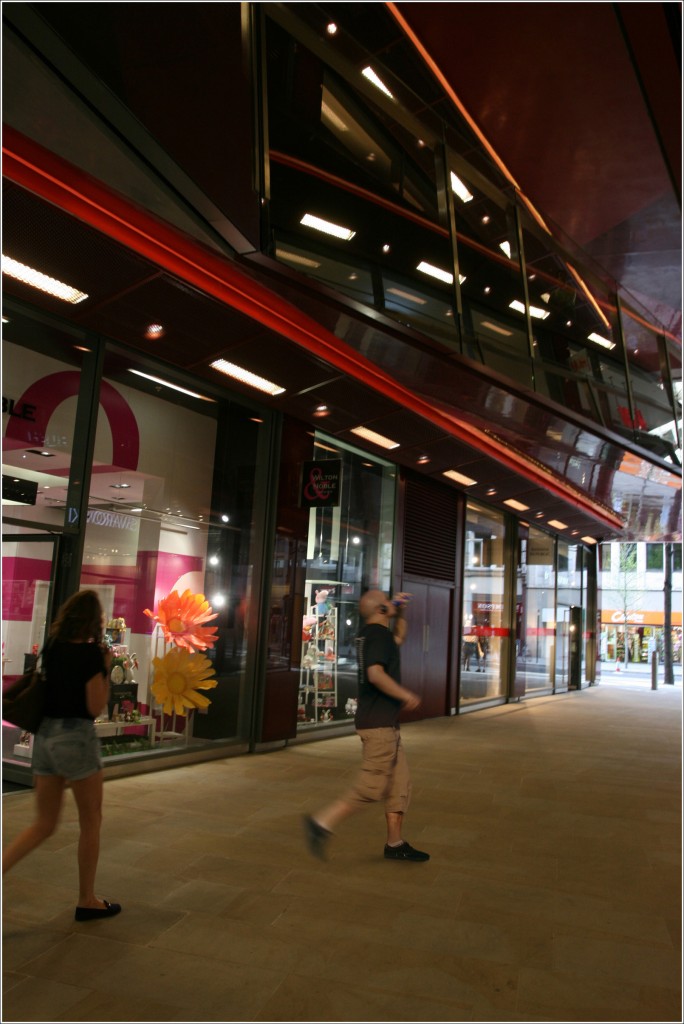
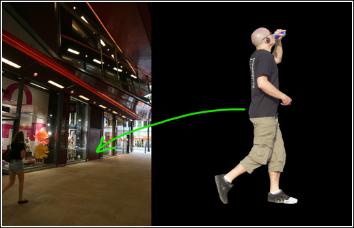
Alright, let me now show you how to apply these principles in our work. I am going to use this RedBull drinking character as a guinea-pig and integrate him into the picture on the left.
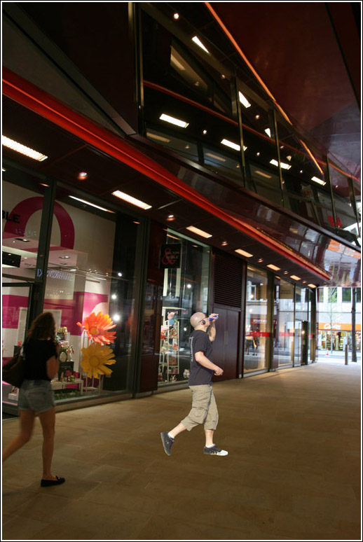
I will start by positioning him in the right perspective, paying attention to the horizon line, the usual stuff, you know.
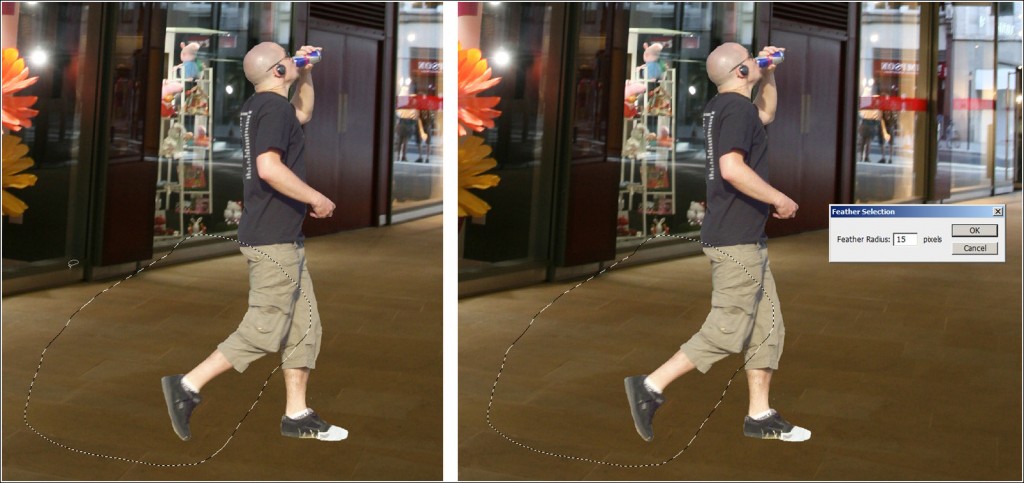
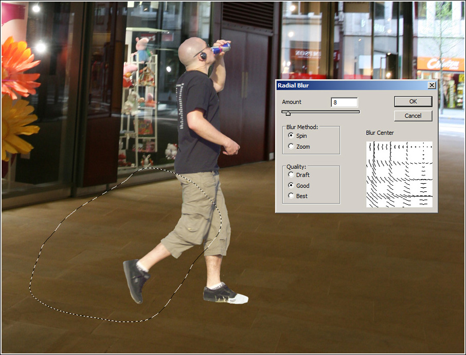
Next, I will select the poor guy’s right leg, using the lasso tool and after some feather selection I will…
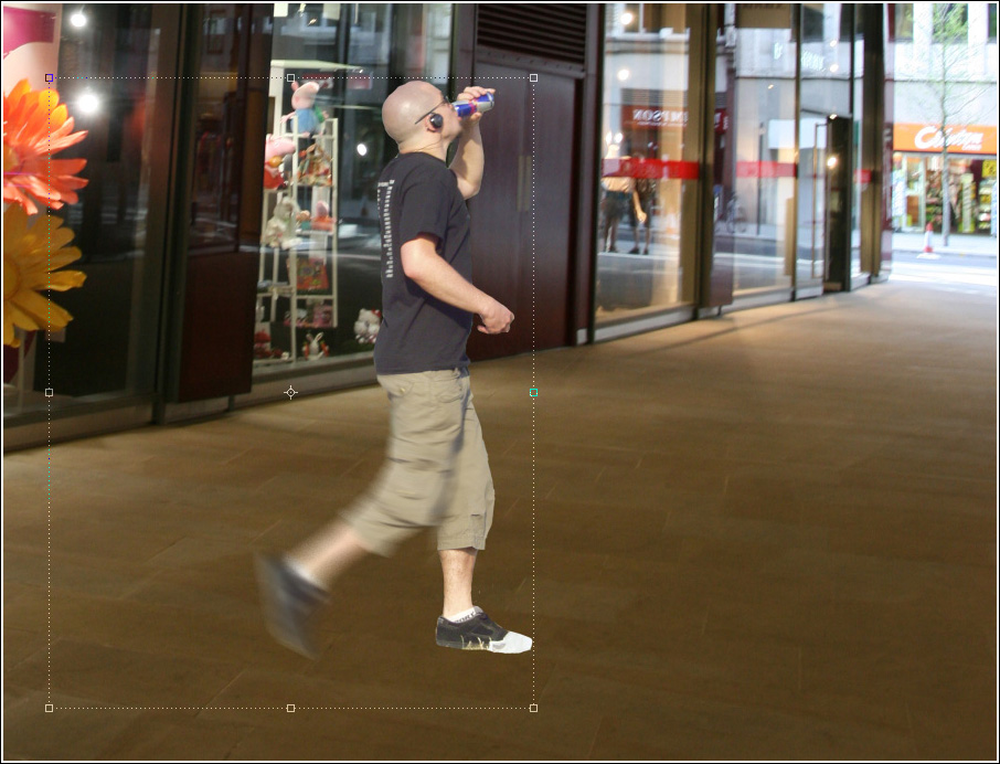
…pull it gently…that is, blur it nicely, using radial blur. Perhaps, something like this:
It is very important to position the “blur center” near the upper right corner, approximately where his hip bone is expected to reside.
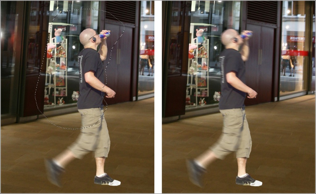
Now I am going to repeat the same procedure for the upper part of his body, using a smaller blur radius and this time I will position the blur center at the lower edge.
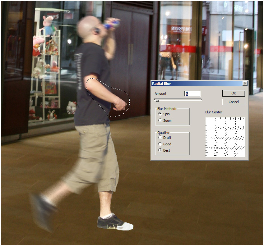
Then I will radial blur his arm all the way down to his wrist and fingers using his elbow as a blur centre (upper left corner in the blur center diagram) :
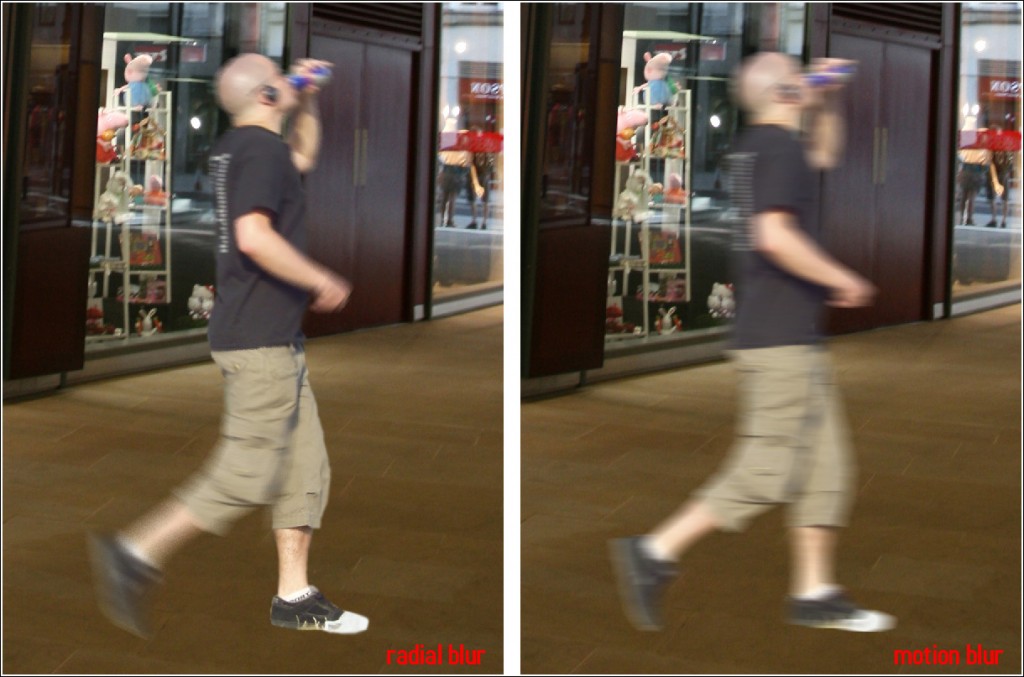
Below is a small comparison between this radial blur technique and the “traditional” motion blur:
And a few colour corrections later, here’s what I get as a final result:
Thanks for watching this little tutorial of ours and if you would give us some feedback on it, that would be just awesome!
P.S.: Due to the numerous requests we receive regarding the actual colour corrections applied, here is the full high-res PSD file ( ~35 MB, RAR) >>> download here!

